Ephraim-Palais
Berlin-born architect and theorist August Endell issued his most important text, Die Schönheit der großen Stadt, in 1908. And this year brings not only our English translation of this title (The Beauty of the Metropolis) but also an exhibition currently running in Endell's hometown that takes the name and content of the book as inspiration. Where the text drew numerous examples from the German capital in its celebration of the urban environment and the aesthetic riches it has to offer, the exhibition focuses on canvases capturing views of a city that has had numerous qualities ascribed to it, but rarely ‘beauty’.
On a bright, cold day with Siberian winds strafing the Spree (this was a while ago, you will note) I made my way from Jannowitzbrücke station to the centrally located Ephraim-Palais, a bijou Rococo palace originally built for the jeweller to the court of Frederick the Great, although deconstructed and reconstructed in the 20th century. The close identification of location and subject matter was confirmed by two works that offered views of precisely the route I had just taken, from differing historical perspectives.
The exhibition takes us from the Biedermeier era to the early 2000s, or as the subtitle has it ‘Berlin images from Gaertner to Fetting’, i.e., from someone you've probably never heard of to someone else you've probably never heard of. This is something of a misdirect, as the show actually offers work by the far more recognisable likes of Max Beckmann, Oskar Kokoschka and Jeanne Mammen. Wisely the pieces are grouped thematically rather than chronologically, but the selection sticks almost exclusively to oil on canvas, with no etchings, drawings or other works on paper. And no photography, although as I note in the afterword to The Beauty of the Metropolis, it is arguably in this medium that Endell’s vision of a citizenry in full aesthetic possession of its urban surroundings is most compellingly realised in the present day.

Extracts from The Beauty of the Metropolis adorn the walls of the show, and both the work and its creator are at home in these surroundings. It wasn’t his building or design works that first brought Endell to public attention, but a rousing piece of art criticism published in 1896, entitled Um die Schönheit (On Beauty). It addressed a major exhibition in Munich that year, in which doughty offerings by seasoned academicians appeared alongside explosive new experiments in form and theme. The text announced Endell as a new and original thinker, one who proposed a radical submission to aesthetic input:
But those who learn to give in to their visual impressions completely, without associations, without secondary objects of any kind, those who just once feel the emotional impact of forms and colours, will find them to be an inexhaustible source of extraordinary, unimagined pleasure. And the moment when the understanding for these things first awakens should be an event in every person’s life. It is like an intoxication, a madness that comes over us. The joy threatens to destroy us, the profusion of beauty to suffocate us. Those who have not experienced this will never understand visual art.
These ideas in turn informed his perception of the city a dozen years later when he wrote The Beauty of the Metropolis. Certainly the variety of experience of which Endell speaks in the book is reflected in this selection. Sharing the same feverish, pre-World War One period with Endell’s text is Ernst Ludwig Kirchner’s well-known Nollendorfplatz, which depicts a relatively new district as the meeting place of almost irreconcilable axes of motion, while Ludwig Meidner’s desolate images of building sites show the city simultaneously claiming yet more of its sandy environs for itself.

Ernst Ludwig Kirchner Nollendorfplatz 1912
There are, it has to be said, a few works evidently selected for their affinity with the theme at hand, with artistic excellence a secondary consideration. Conversely, other artists are exposed in a new light. Jeanne Mammen's images of demi-mondaine city-dwellers may be familiar, but here she is represented by an unpeopled image of a church (thought to have been executed in the late 1930s), rendering the scene in a way that didn't at all conform to the Nazis' approved styles. And while I was dimly aware of the work of Impressionist Lesser Ury from reproductions, here they appeared as a revelation, one that brought Endell’s words vividly to mind. The most thrilling and evocative was a nocturnal study of the Landwehr Canal, and Endell’s depiction of this waterway in The Beauty of the Metropolis could be a transcription of Ury’s image (which unfortunately doesn't reproduce well):
The thick treetops prevent light from making its full impact. The quiet buildings rise darkly behind the shadowy clouds of the treetops. The gas lanterns seem like points of light attracting cabs and automobiles; a fine, blinking web of stars spreads out above this dark mass. The smooth, turgid water is completely dark, and this silent, spectral mirror below reflects the gentle life of the night above, shimmering at the passer-by.
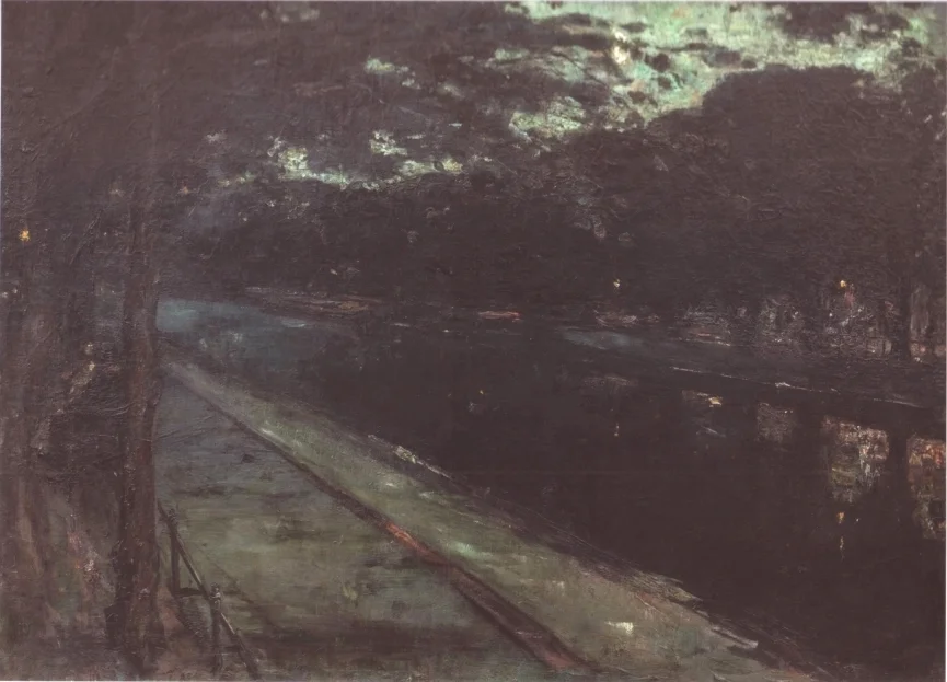
Lesser Ury Abend am Landwehrkanal 1889
Night takes on a far more sinister iridescence a century later in Wolfgang Peuker’s imagining of the (old) Chancellery, a scene populated solely by outsized martial statuary at the entrance of Hitler's intimidating lair. This is a rare retrospective view, with most artists sticking to their own eras, as seen in Louise Rösler’s deceptively festive Marsden Hartley-esque study of Kurfürstendamm on the eve of the Second World War, and Karl Hofer’s desaturated view of the bombed-out city after its conclusion. Konrad Knebel’s Straße mit Mauer (1977) is one of numerous works to depict the divided city in the Cold War, but while it depicts the Berlin Wall itself, its perspective magnifies the adjacent apartment blocks with the odd effect of reducing the barrier to the status of an almost incidental plane. Meanwhile Stefanie Bürkle’s Weinhaus Huth (1995) brings us forward to the redevelopment of the post-reunification era. Here skeletal concrete behemoths dwarf a tenacious remnant of old Berlin in the form of the eponymous building, almost the last original structure left standing on or around Potsdamer Platz following wartime bombing and the construction of the Wall.
Perhaps the most surprising work here is Oskar Kokoschka's Berlin, 13. August 1966. For one, I had no idea Kokoschka was still active in 1966 (and was further surprised to discover he lived until 1980). Not just that, the work was created at the behest of Axel Springer, and depicts the view over East Berlin from the top of the publisher's new high-rise, built right on the course of the Wall. Springer’s conservative, staunchly pro-American tabloid provocations would soon make him one of the bogeymen of West Germany’s ’68 generation, so it is all the more unusual to find him here in association with a survivor of the Weimar avant-garde.
For anyone familiar with Berlin, it is difficult to avoid trying to identify locations and individual features, but here – again – Endell is way ahead of us. It is not the metropolis that we should be seeking, but the beauty within it:
But only in our present era have we slowly begun to realise that form and colour do not derive their beauty from the object, that there may indeed be a beauty that is not even perceived in the object when we observe it for purely practical purposes, and that it is only artistic vision that confers upon the object the beauty that resides in form and colour, independent of all material relationships.
Die Schönheit der großen Stadt continues at Museum Ephraim-Palais, Berlin, until 26 August 2018